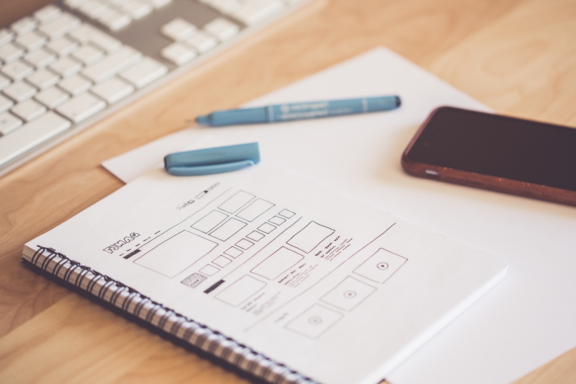
Web design has arguably become more difficult in the past few years because so many of us use websites on mobile. This means that good web design (and good UX or user experience) is more important than ever because people are using smaller screens to navigate their way around the web.
There are many things to think about when designing a website but here are a top few that we think are most important.
- Pages that have clear purpose. If you’re designing a site map it’s easy to create too many pages, resulting in too many clicks, or too few pages, resulting in pages crammed full of differing topics. For SEO purposes and for good design and usability, you need about 300 words on each page, and not more than about 800 (unless it’s a long blog post or article) so that the reader doesn’t get overwhelmed. So, make sure that each page has a specific job, purpose and reason to exist on your site.
- Clear calls to action. A call to action or CTA is the thing that you want someone to do as a result of landing on your page. If your page is full of information but no links, buttons or ‘calls to action’ then you aren’t making it easy for your user to do what you want them to do. Be sure to include CTAs where appropriate on the page such as ‘contact us’ or ‘buy’ or ‘find out more’ to ensure that you take the user on an easy journey.
- Negative space. Websites need to have room to breathe or it’s hard to find the information that you need, so negative space is important in web design to make sure that there’s enough space for the design to work. Don’t cram your design too full – people are used to a long scroll on a phone so relax, you don’t need to stuff everything above the fold any more (the space at the top of a website that you see before scrolling). Good design, whether it’s on a website or not, needs lots of space to look its best.
- Typefaces. You need to create a site that is google friendly (so google fonts need to be used) and that’s easy to read. That means a minimum of 16px for typeface size and something that’s on brand, easy to read, professional looking and that gives a bit of variety. When we design a site we usually select up to three typefaces, for different types of headings, so that there’s both variety and consistency on the page. Mix your fonts carefully and make sure they’re on brand.
- Colour. Use colour carefully to make the most of your website, keep your branding consistent and to add negative space and visual interest but don’t stuff it with colour or it will look too busy and it will distract the user. A colour palette of up to four or five colours would be the maximum that we would recommend when designing a website and make sure you use them consistently.
- Imagery. Images can make or break a site so good images are really important, especially if your site is image-led. If you are trying to sell a product or service then the quality of the photos you supply to your web designer are crucial. Low res or badly oriented photos will make it look awful so either use quality stock imagery or commission some proper photography – we promise that it will make all the difference! Photos need to be high resolution, well lit, professionally lit and shot and they need to make you look good, not amateur so don’t scrimp on this one, it’s not worth it.
- Clear navigation. Following on from CTAs and pages with a clear purpose, any web design needs to have clear navigation. We use drop down menus and mega menus to ensure that a user can find where they are going within one or two clicks. If someone on your website has to go through more pages than two or three at the very maximum then you need to revise your sitemap. Make sure it’s easy, and obvious, to find things! Use links to make it easier for the reader where relevant.
- Grid layouts and an F pattern design – readers naturally read from left to right, top to bottom (making an ‘F’ shape) so make sure that your page designs work in a way that’s obvious and works with that pattern. (That’s why most websites have their navigation at top, towards the right hand side because it’s how people naturally read). Designing complex information or products in a grid pattern helps to order the information sensibly and reduces the danger of the information being presented as chaotic or messy.
- Mobile Friendly sites. All our sites are completely mobile friendly, meaning that they work properly on a mobile – every single bit of the site. This, in a world where almost half of web traffic is on mobile, is crucial to the success of any website and it’s one of the key considerations for us when we are putting a site together.
- Load times. We employ plugins like SMUSH which reduce picture file sizes so that we can makes sure that pages load quickly and cleanly. We also ensure that we build using the least amount of code possible so that pages don’t take ages to load or fail. We know that users get frustrated very quickly when looking at a website so this is key to our technical build.
There are plenty of other things to consider when making a new website but that’s our starter for ten – so if you are thinking about getting a new web design for your business or organisation then drop us a line – we’d love to quote and to work with you to create a really great new website that gives you the results that you want.


